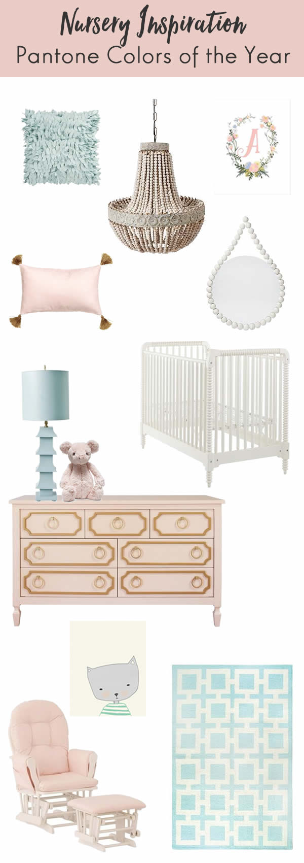
SHOP >> shaggy pillow // chandelier // floral print // tassel pillow // mirror // crib // lamp // stuffed animal // dresser // cat print // glider // rug
I am seriously in love with Pantone’s Colors of the Year, Rose Quartz and Serenity. Even though we typically think of light pink and light blue as baby colors, Serenity and Rose Quartz are like the older siblings of powder blue and pink. They’re slightly muted, making them more sophisticated than their little brother and sister. It got me thinking that these two, especially together, would be the ideal combo for a nursery. I couldn’t help but put together a nursery inspiration board.
I should add that this is NOT what I’m doing for my nursery, though I love it just as much as what I went with. I’m not that into babyish nurseries, mostly because I don’t want to have to have to redo the child’s room too soon. I decorated both of my girls’ rooms with the idea that I won’t have to change their rooms until they’re ready to have input in the matter.
For the first time ever, Pantone selected two colors, and I love how complementary they are to each other. I can see these colors being used in both a little kid’s room and an adult’s room. I’d toss in some gold and bronze accents and you’ve got a winning combo. I put together this nursery inspiration board that features a mix of the two Pantone Colors of the Year + some gold and white neutral pieces. The result is a room that a child would love for years to come.
What do you think of Pantone’s choices? Would you use this color combo in your home, or even these two colors separately?
** This post contains affiliate links.


I’m in love with Pantone’s colors! Serenity is my favorite! Your nursery inspiration board is gorgeous and I love that it doesn’t look babyish at all. It’s so pretty!
I’ll take one of everything! It’s all so gorgeous. I love both colors and together they are amazing.
I’ve seen these colors around but I didn’t realize this look had a name. Very interesting! I love shabby chic and pantones would totally fit in with my decor.
I’m a sucker for nursery art. Love that cat picture. My daughter’s nursery (that she’s never slept in. ha) was inspired by an owl canvas I fell in love with!
Pantone’s colors are beautiful, classic and inviting. I love all of the items that you’ve selected for this virtual nursery design. If I had little ones right now (my girls are already grown), I’d love to have a nursery with all of these gorgeous items. 🙂
I absolutely love that tassel pillow!! Your decor picks are gorgeous!
I love the color combo! So very soothing and beautiful. I would like this in our nursery.
Those are really pretty colors. They are muted and classy. I could use you to decorate my whole house.
I love the muted colors! Very pretty!
I love these colours! They work so well together. It makes a very calming environment.
This is such a great color palette for relaxing parents while they are working with baby. I love how subdued it is – might even adapt for our room! Thank you.
So so pretty! Love that teal!
This is so cute!
I love this! I cannot wait until we start our family and I can decorate a nursery. I’m loving neutral kind of colors. And I’m obsessed with blush pink, but that wouldn’t work out too well if we had a boy haha
So pretty! I really love the Serenity tone. I have a lot of that in my bedroom. You did a great job with this!
So pretty! Love what you did.
This is gorgeous! Very french country chic.
Really love that rug. I think these colors of the year fit so well with a nursery. So pretty!
I love each and every item on your collage. The colors are so calming and beautiful. I’d love to use this color scheme in my office.
These are indeed gorgeous colors and items for a nursery. I love the chandler which I never thought of for a nursery and that rug is just gorgeous.
That glider and ottoman looks so comfy! Do I have to be building a nursery to buy one, lol
I love these colors for a nursery. But I’m thinking I need that chandelier for my own room – so pretty!
Loving the white crib and chandelier!! My husband and I have been debating on when we want to try for our third baby. While I love being a boy mom, and deeply want a baby girl. I absolutely LOVE looking at little girl things!
This is so beautiful! I love the idea of having a nursery inspiration board! Love it!
Oh I love this nursery idea. My youngest is 3 months and I still have yet to do her nursery. I really need to.
I would love to use both colors in my home! I think they would be amazing for my room and bring out the other elements I have in it.
I wasn’t thrilled with the colors of the year, because I like bright and bold colors. These look perfect in a nursery though. So soft and calm.
I’m getting ready to redo my office and I am seriously considering the rose quartz. These colors are so versatile.
So pretty! Love the colors and the inspiration!
I love how classy and classic everything is. Absolutely lovely.